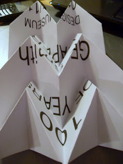
For the second task of this Brief we have to design and make a poster celebrating 100 years of GF Smith Paper and we should use the skills we have learned in our workshops to complete the task. The limitations are: it must contain 100 years of GF Smith Paper, Design Museum, 01-31 July 2011 and it must be an A2 portrait format.
GF Smith Paper.
From the images below I can see that the company likes to mostly use Black, white and primary colours. They also only use san serif type, and are very proud of there history.


Peter Callesen.
GF Smith Paper.
From the images below I can see that the company likes to mostly use Black, white and primary colours. They also only use san serif type, and are very proud of there history.


Peter Callesen.
These are probably my favourite from all the paper engineering research I have done, they are quite funny and pretty and I would possibly use influences from this in my own work. I like the delicacy of them, the attention to detail, and I think the cut out is as effective as the creation.


Development.
Below are some poster experimentation's using influences from Callesen's work i think they are quite successful. I will try this with more colours and will also try to mix this with the pleating idea.
Below are the above tester repeated on colours card, they do look good but I do think the with one is more effective. Again i may try using other colour and better photographing as i don't feel they are as strong as they could be.
I took this accidentally with the flash on my camera, but I do think it would look ok as a poser still.
I will now try this same technique but adding some digital text in photoshop. This would mean I my only use one part as hand made? possibly GF Smith Paper?
Change Of Plan.
After attending my last workshop i have decided to change y idea (many other people where doing the same thing), so I've gone back to the pleat.
I want to use the pleat again, but I would like the type to be included and go with the paper.....like below.
Below is a piece of paper with the text printed on and pleated, its very simple but I think it looks brilliant.
Below is the same idea but with smaller text again its very simple but very effective.
Again below is the same type printed the same size but cut out with scotch tape over the top and the laptop light shining behind. I do think it would look better with a heaver paper and this is just printer paper and therefore is very see through.
I tried the above again using heavier paper and it worked a lot better.
I pleated the cut out paper and put different coloured backgrounds.
I also tried the light one again but decided against it.


No comments:
Post a Comment