Wednesday, 4 May 2011
Final Animation.
There are two versions of my final animation, they are the same but the music is different I have not yet decided which music to use.
The first option is the first 24 seconds of the music.
The second option is 2 minutes into the music where there is a change ing the music at the end to co-inside with the kite falling.
Tuesday, 3 May 2011
Development.
Below are still for my final piece.

She unravels the kite.

The kite starts to get pulled by the wind.


The kite gets pulled around.


The wind stops and the kite starts to fall.

Wednesday, 6 April 2011


Tuesday, 5 April 2011
Storyboard Development.
Inspiration.
I picked fun, youth and sun for my three words. So I have looked at things that you like to do when your a child and an adult. I have concentrated on biking, roller skating ( you hear about every body roller blading in L.A and places like that) and kites.

Ride A Bike.
I have included bikes because it is something people of all ages like to do on a hot summers day. I however don't think I will use biking in my animation.

This is my favorite, a little girl is riding down the hill with people watching, there's a ramp, she jumps it. She does three summer salts and stop to poke her tongue out at her unwanted crowd.

Fly A Kite

When you go to a British beach there full of shops selling, floats, blow ups, sweets, and KITES!! I always remember going to the beach with my family and us buying a kite and flying it all day on the beach, but it would always crash and break and you would have to get another one.

I've included clips from Mary Poppings because it has a hole song devoted to kite flying, not just children, but adults and old men!

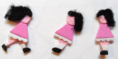
Character Design.


I have made these characters using EVA foam and felt.
Flying a kite is not just something I liked to do when I was a child, its something you like doing as an adult as well, and I'm sure there are many other people that like to take there children to the beach and pretend there buying a kite for there children but its really for themselves.

I have done a simpler version, this is similar to the Kate Nash video, I really like it. I could do this as a flip book, cell animation or stop motion. I also think it might be a nice touch to do this in sand.


The clip of music I would use for the above kite animation.
The Storyboard for this animation and music.


Music Video's For Inspiration.
I love this video, it's so simple, cute and lovely. The music seems to be sad but the lyrics are beautiful and the animation compliments that. It is a stop motion animation, I could use this it would create a great final piece.
Again the animations are beautiful and compliments the music but it is very different to the Kate Nash one as it includes real life and animation. This could be a lovely effect on my piece, I am thinking of beaches for my piece I may be able to do an animation in sand? That would incorporate the real life aspect.
This video is completely animated and done on the computer, it is deliberately made to look pixelated. Its a great animation it completely fits the music, very upbeat playful and fun.
This animation by Hed Kandi's designer Jason Brook's its great and I have included it because of the beach theme, parting, drinking having fun and being young, which all fit with my music. However I don't think I would use this idea in my peice.
Gorillaz is a perfect example for inspiration for this project because the band is completely animated! Its not a real band, the music is mostly electronic the voice is adjusted using computers, there are no people representing this band, just characters created for it.
Monday, 4 April 2011


Wednesday, 30 March 2011
My First Animations.
Stop Motion.
Stop motion is an animation technique to make a object appear to move on its own. The object is moved in small increments and individually photographed, these are frames, when the frames are played as a continuous sequence it creates a illusion of movement.
Today I had my first animation lesson, this was a workshop on using i stop motion pro. We where given some toys, a camera and a mac, using these and the programme we had to create a short animation. We had to input all the key movements into the computer using the camera and when put together the programme would run it in a fluid motion.
I have included this sand animation because I could see myself using sand in may animation.
Cell Animation.
I decided for my character to do a little girl as I want to use a girl in my animation, and its supposed to show youth.


Stop motion is an animation technique to make a object appear to move on its own. The object is moved in small increments and individually photographed, these are frames, when the frames are played as a continuous sequence it creates a illusion of movement.
Today I had my first animation lesson, this was a workshop on using i stop motion pro. We where given some toys, a camera and a mac, using these and the programme we had to create a short animation. We had to input all the key movements into the computer using the camera and when put together the programme would run it in a fluid motion.
The first animation is believed to be, (and is in the Guinness world record book as) Albert E. Smith and J. Stuart Blackton's The Humpty Dumpty Circus 1898, in which a toy circus of acrobats and animals comes to life, this film however has been lost.
More recent stop motion animations;
The Nightmare Before Christmas, directed by Henry Selick and produced by Tim Burton was one of the more widely-released stop motion features.
Henry Selick also went on to create James and the Giant Peach and Coraline,
Tim Burton went on to direct Corpse Bride.
Nick Park, found fame in clay animation and created the characters Wallace and Grommit. his first feature length film grossed $100 million!!
Stop Motion Aanimations I've Found And Like!
A guy recreated a scene from Greece using Lego for his dissertation.
I have included this sand animation because I could see myself using sand in may animation.
Cell Animation.
I decided for my character to do a little girl as I want to use a girl in my animation, and its supposed to show youth.

I partnered with a girl who's character was a teddy bear, so for our cell animation we chose to do a teddy bears picnic for our 2 seconds.
First the little girl is on her own.

Then the teddy bear comes to join her.

She pours him a drink and they sit and have tea together.

Story Telling.
All forms of communication are ways of telling stories, happy, sad, past, present, future, personal, it is also a way of expressing our thoughs.
What Is Animation?
Annimation is the illusion of movement. When single images are passed in froung of the eye quick succession (more then 10 frames a second,) the illusion of movement can be created in the mind. Frame rate is measured in frames per second (FPS), normally 12/25/30FPS.
Early Animation:
1820's Thaumatrope

1840's Zoetropes.
1880's Eadward Muybride. This annimation was to win a bet about horses feet leaving the ground. The images below are the stills but this is actually a film.

1930's Masters of animation Wald Disney. All hand drawn frams on a timeline made into an annimation using a flip book technique, the new annimation still uses timeline and frames.

What Is Animation?
Annimation is the illusion of movement. When single images are passed in froung of the eye quick succession (more then 10 frames a second,) the illusion of movement can be created in the mind. Frame rate is measured in frames per second (FPS), normally 12/25/30FPS.
Early Animation:
1820's Thaumatrope

1840's Zoetropes.
1880's Eadward Muybride. This annimation was to win a bet about horses feet leaving the ground. The images below are the stills but this is actually a film.
1930's Masters of animation Wald Disney. All hand drawn frams on a timeline made into an annimation using a flip book technique, the new annimation still uses timeline and frames.
PRINT TO PIXEL
New Brief.
The new brief is to create a 20 to 30 second animation to go with a given piece of music. It will be assessted in two parts, storyboard and then process and the animation. My assigned music is Melting Pot by Boris Gardener.
The new brief is to create a 20 to 30 second animation to go with a given piece of music. It will be assessted in two parts, storyboard and then process and the animation. My assigned music is Melting Pot by Boris Gardener.
Three words I associate with this music are Fun Sun and Youth, the music reminds me of summer, beaches, flying kites, roller skating , beer gardens, driving through the country side with the windows down but it also reminds me of music they play when your on hold to the phone company, British gas, Inland Revenue and all those other annoying companies.
Wednesday, 9 March 2011

Saturday, 5 March 2011
Poster.
For the second task of this Brief we have to design and make a poster celebrating 100 years of GF Smith Paper and we should use the skills we have learned in our workshops to complete the task. The limitations are: it must contain 100 years of GF Smith Paper, Design Museum, 01-31 July 2011 and it must be an A2 portrait format.
GF Smith Paper.
From the images below I can see that the company likes to mostly use Black, white and primary colours. They also only use san serif type, and are very proud of there history.


Peter Callesen.
GF Smith Paper.
From the images below I can see that the company likes to mostly use Black, white and primary colours. They also only use san serif type, and are very proud of there history.
Peter Callesen.
These are probably my favourite from all the paper engineering research I have done, they are quite funny and pretty and I would possibly use influences from this in my own work. I like the delicacy of them, the attention to detail, and I think the cut out is as effective as the creation.


Development.
Below are some poster experimentation's using influences from Callesen's work i think they are quite successful. I will try this with more colours and will also try to mix this with the pleating idea.


Below are the above tester repeated on colours card, they do look good but I do think the with one is more effective. Again i may try using other colour and better photographing as i don't feel they are as strong as they could be.


I took this accidentally with the flash on my camera, but I do think it would look ok as a poser still.

I will now try this same technique but adding some digital text in photoshop. This would mean I my only use one part as hand made? possibly GF Smith Paper?
Change Of Plan.
After attending my last workshop i have decided to change y idea (many other people where doing the same thing), so I've gone back to the pleat.
I want to use the pleat again, but I would like the type to be included and go with the paper.....like below.

Below is a piece of paper with the text printed on and pleated, its very simple but I think it looks brilliant.


Below is the same idea but with smaller text again its very simple but very effective.

Again below is the same type printed the same size but cut out with scotch tape over the top and the laptop light shining behind. I do think it would look better with a heaver paper and this is just printer paper and therefore is very see through.

I tried the above again using heavier paper and it worked a lot better.

I pleated the cut out paper and put different coloured backgrounds.


I also tried the light one again but decided against it.

Subscribe to:
Posts (Atom)